UPDATE 2: Hmm, this really isn’t how I remembered the movie…

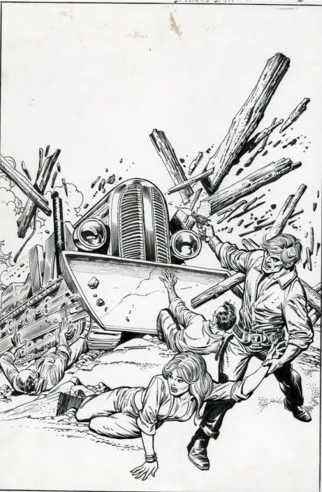
UPDATE:  By coincidence, the original artwork by artist Gil Kane is for sale on eBay right now; the owner is asking for $1300.  Anyway, look at the much more restrained art Kane provided.  He must have been pissed when he saw how goofily they retouched it.

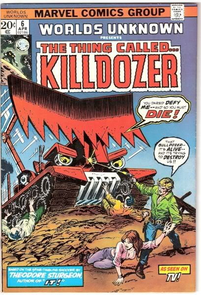
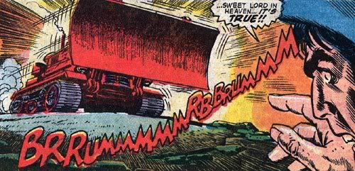
Here’s some interior art for the comic, not by Kane:

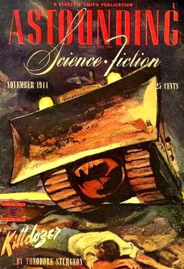
Second update:  Just for grins, here’s the original magazine artwork for the story’s initial publication in 1941:

  • Rock Baker

    Worlds Unknown, huh? Boy, did I goof on that one! I thought it was part of the Marvel Classics Comics collection, of which I have the First Men in the Moon adaptation right behind me.

    Kane provided a very nice piece indeed, although I’m not wild over his faces, he has a much better handle on drawing machinery than I do. I’d forgotten how wild the bulldozer looked on the cover, I wish I’d read it when I had the chance and gotten a look at how it was drawn inside. The cover version looks like something the Killer Klowns might’ve built.

    Also, was there a girl in either earlier version of the story? Indeed, does she even appear in the comic itself? The 70s hairstyle of the hero seems to imply the comic version was updated like the movie was.

  • John Nowak

    Flame me if you must, but Killdozer pushes my buttons as hard as zombies. The idea of something inanimate deciding it wants to kill you… brr.

  • Well Mr. Nowak, I assume you’re a huge fan of THE MANGLER and MAXIMUM OVERDRIVE?

  • Rock Baker

    I just had an idea for a killer 747.

  • BeckoningChasm

    I wonder if the interior art was by Johnny Romita. I’d guess Ross Andru, except the guy’s face isn’t throwing off light-beams the way every Ross Andru face does when surprised.

  • TongoRad

    Goofy doesn’t even begin to describe it. That is the least functional bulldozer imaginable, what with the blade support that will snap like a twig, and the bottom of which wouldn’t push very much dirt anyhow. Then again, maybe it makes sense if you look at it that way…

    The original artwork for the Sturgeon story is suitably grim, I like that one.

  • Rock Baker

    “…the guy’s face isn’t throwing off light-beams the way every Ross Andru face does when surprised.” Are you saying Andru started this trend? This has become a sort of comic book shorthand, one I’ve used myself, just because its what you do to indicate surprise. Or are you noting that Andru had a certain style to his ‘light-beams’?

  • BeckoningChasm

    Rock, yeah I know that’s common comic shorthand and has been used (and used well) by lots of people.

    Andru, though, seemed to use it SO OFTEN that I just noticed it more with him. It’s like when you hear someone use a particular word, and you keep hearing it LOUDLY whenever he uses it, even though he may use it no more than any other person.

    Andru really did seem to use it all the time, though. “Oh, no, I don’t have enough quarters to do laundry!” FACE FLASH.

  • Foywonder

    I have that KILLDOZER comic somewhere in my old comic collection. If the movie had been more like the cover of the comic it probably would live up to its reputation.

    Am I alone in finding KILLDOZER more boring than fun? Having viewed it a while back I couldn’t get over how tedious it was. It seems to me KILLDOZER is like BREAKIN’ 2: ELECTRIC BOOGALOO in that it’s more famous for the camp value of its title more than for the film itself.

  • BeckoningChasm

    You know, sometimes you gotta love the old word balloons. There’s the guy saying what should have been obvious well before now, and the Killdozer insisting that the humans “def[ied]” him.

    Killdozer: Hey, let’s watch Modern Marvels!
    Human: No way, there’s a bikini special on.
    Killdozer (thinks): I’ll get you for this. Just you wait.

  • John Nowak

    >Well Mr. Nowak, I assume you’re a huge fan of THE MANGLER and MAXIMUM OVERDRIVE?

    Haven’t seen either one; word of mouth was terrible. I like Sam Jackson and John Williams; I didn’t see Revenge of the Sith

  • Rock Baker

    I can’t help but be impressed with Kane’s inks (I assume he did his own inks, something I’ve never gotten the hang of).

  • Rock Baker

    “KILLDOZER is….. more famous for the camp value of its title more than for the film itself.” I’m not sure I buy that. I understand it did extremely well on television and went on to become a sydication juggernaut (until about 15 years ago for some reason). Look at the comic book cover again, where they’re obviously hoping some of the luster of the movie will rub off on them.

  • alex

    I can’t tell you how many times I saw an original cover of a Marvel comic that was better than the final product. What was going on there? Did they not trust their artists or something? Kane’s original is so much better. There’s plenty of Kirby covers that were tinkered for no reason too.

  • Luke Blanchard

    They were concerned about selling the comics, and back then comics were primarily bought by children. In this case, the changes turn the Killdozer into a monster and make it clearer that no-one is driving.

    In the 60s the Comics Code Authority sometimes mandated changes.

    The inker of the cover certainly wasn’t Kane, as his inks look quite different. The Grand Comics Database currently credits the inks (except on the redrawn Killdozer) to Ernie Chan, who back then was often credited as Ernie Chua.

    It also credits the art on the story to Dick Ayers and Chan.